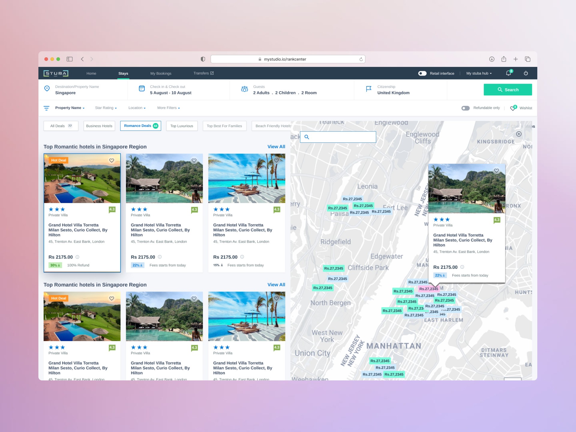
I redesigned trial registration so parents could add multiple participants, choose the right class for each person, and enter shared buyer information once.
Role
Product Designer | Checkout strategy and systems
Company & year
2026 | MyStudio
Team
I partnered with Product, enterprise stakeholders, frontend and backend engineers, and QA.

Before
After
Context
MyStudio was moving checkout from a tightly coupled V1 platform to a modular V2 system
MyStudio is a B2B2C platform used by martial arts, fitness, and afterschool businesses.
Studio teams use MyStudio to create programs, trials, memberships, events, registration requirements, and payment rules.
Their customers use public checkout pages to register participants and purchase those offerings.
MyStudio was modernizing the platform and gradually replacing V1 experiences with V2.
The V1 checkout pages were not modular. Checkout logic, fields, and behavior were connected across different parts of the product. Changing one experience could create unexpected problems somewhere else.
Because V1 would eventually be replaced, engineering wanted to avoid extending its tightly connected checkout pages. The business also wanted future checkout investment to support the modernized platform.
Problem
Customers wanted to buy multiple items, but V1 checkout processed only one item at a time
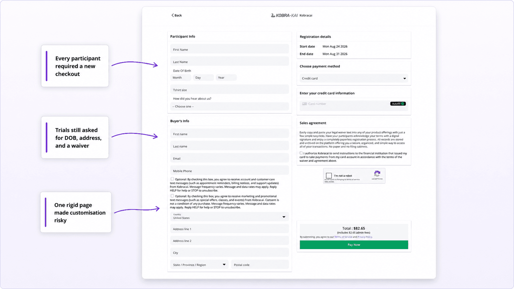
The V1 checkout was designed around one item, one participant, and one transaction.
Customers who wanted to purchase multiple trials or register multiple participants had to complete checkout separately for every item.
An enterprise client also needed a simpler trial experience. Its customers were being asked for addresses, waivers, date of birth, registration fields, and other information that the trial did not require.
Studio teams could not control the visibility of these fields during trial setup.
Customers needed a faster way to buy multiple items. Studios needed control over the information collected for each purchase. The business needed a faster, modular checkout without making another large investment in fragile V1 pages.
The challenge was to align these needs without breaking the existing checkout or limiting the future platform.

Research
Customer feedback validated the proposed cart direction
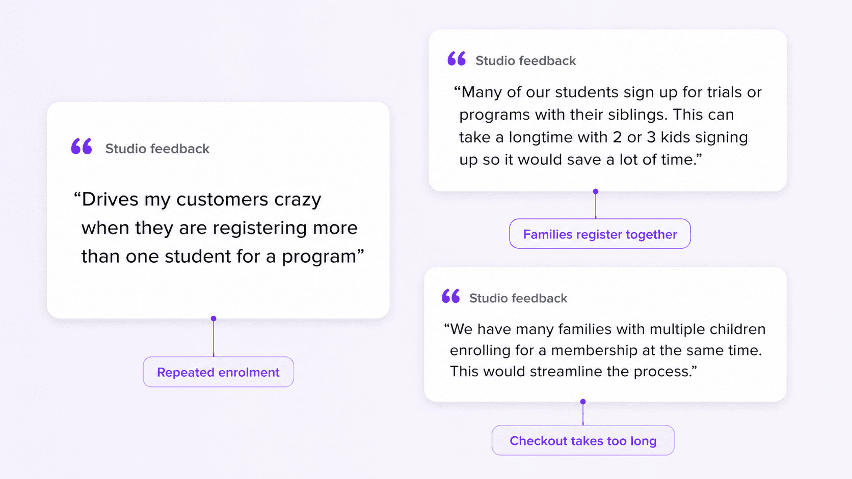
The problem and initial solution were already defined. I reviewed 114 feedback entries to confirm the broader need and prioritize the first release.
Ninety-four entries focused on multi-registration, and 79 were rated important or critical.
One journey for multiple items
“It would be great to do multi-registration rather than registering individually.”
This validated a category-level cart for multiple trials and participants.
Less repeated information
“This can take a long time with two or three kids signing up.”
This supported collecting shared buyer and payment information once.
Different registration paths
“Allow people to book multiple classes at the same time.”
This confirmed that each item needed its own participant, trial, class time, price, and registration requirements.
The research validated the proposed direction and refined the first-release scope.
The remaining challenge was technical: make checkout feel like one connected cart while the backend processed every item through a separate call and transaction.

Decisions and tradeoffs
Build one reusable checkout system first
Decision:
Research confirmed the need for one multi-item journey. I created reusable Figma components and pricing patterns shared across admin POS, public POS, and open-URL checkout. Claude assembled the first flow from those rules, and I reviewed and changed the experience before handoff.
Tradeoffs:
The shared system took more work at the start, but prevented repeated design work, inconsistent behavior, and extra engineering interpretation later.
Constraints:
Engineering: All three entry points had to share participant, pricing, payment, and data logic within the current backend. Stakeholder: The first release had to stay simple for trials while supporting future categories.
Result:
Reusable components and AI-assisted assembly reduced the estimated design cycle from three weeks to one. Engineering received shared patterns and a working structure.

Before
After
Make enterprise requirements configurable
Decision:
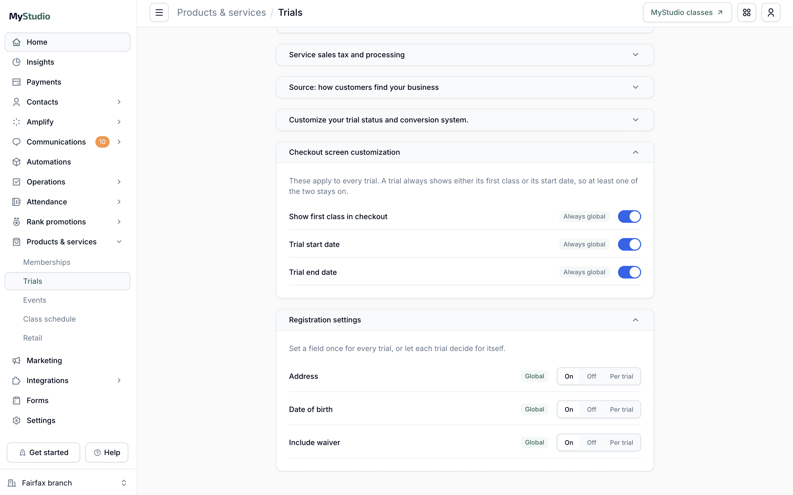
Instead of creating a separate enterprise checkout, I made waivers, addresses, date of birth, registration fields, fees, themes, and open-URL behavior configurable. The same components reflowed when fields were hidden.
Tradeoffs:
A separate design would have met one client request faster. Configuration required more testing but prevented client-specific product forks and inconsistent checkout behavior.
Constraints:
Engineering: Settings came from backend data because a self-service admin interface was outside the first release. Stakeholder: The enterprise fields had to be hidden on schedule while the standard checkout still worked for other studios.
Result:
One checkout supported both standard and simplified registration without creating a separate product version. The same configuration pattern could support future categories.
Before
After
Give each participant their own registration path
Decision:
Customers could add another participant to the same class, choose another class time, or select a different trial. Each item kept its own participant, class, price, discount, and registration requirements.
Tradeoffs:
Copying the first selection would be faster, but it would only support families joining the same class. Three paths added complexity but covered realistic purchases.
Constraints:
Engineering: Direct trial links did not always include the full catalog. New calendar APIs, the 180-day limit, and class capacity also had to be handled for every participant. Stakeholder: The flow could not assume that every family member needed the same offering.
Result:
Customers could add several items without restarting checkout, while the common same-class path stayed fast.

Before
After
Keep one cart honest about separate transactions
Decision:
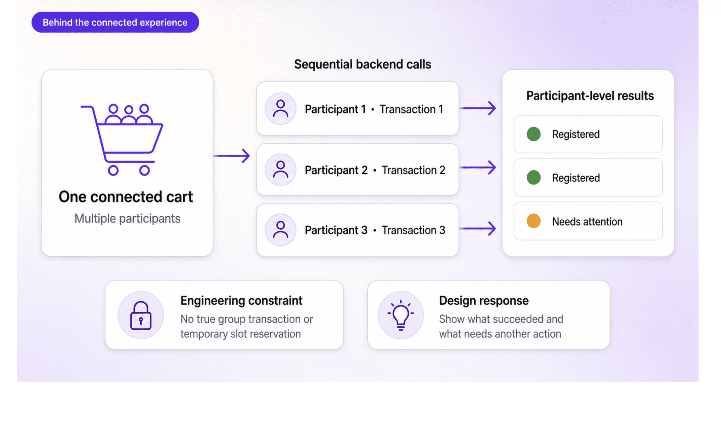
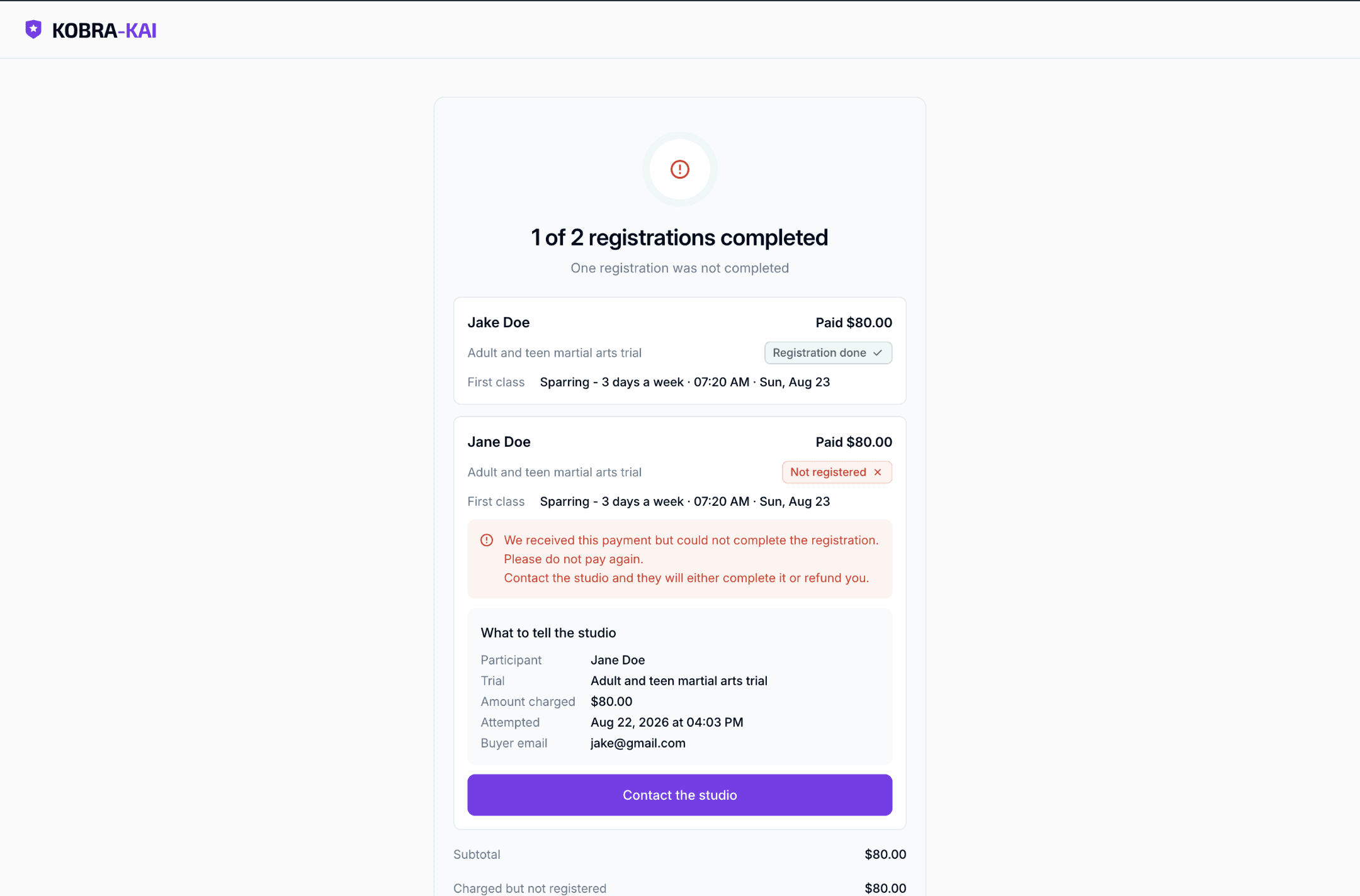
The interface presented one connected cart, but the backend still processed one item at a time. I designed the order summary, payment explanation, and confirmation around participant-level status and separate charges.
Tradeoffs:
Calling it one transaction would look simpler but could mislead customers about whether every item would succeed. We chose transparency.
Constraints:
Engineering: Each item required a sequential call and separate transaction. Successful registrations could not be rolled back, class spots were not reserved, and payment and registration could produce different results. A cart UUID linked the requests. Stakeholder: The team could not promise an all-or-nothing cart before the backend existed.
Result:
Customers could buy multiple items in one understandable journey, studios controlled required fields, and engineering gained a modular V2 foundation for the future global cart.

Before
After
Outcome
One connected family journey
Parents could add and review multiple participants without restarting checkout.
Three participant paths
The flow supported the same class, a different class time, or a different trial.
Clear transaction expectations
Separate charges and participant-level results were explained instead of hidden.
Enterprise review supported the direction
Client reviews supported configurable fields and the connected family checkout direction.
Solution
One modular checkout for multiple trials and participants
1. Add multiple items
Customers could add multiple trials and participants from the public checkout, admin POS, or an open-URL trial link. Each item stayed connected to the correct participant, trial, class time, and price.
2. Complete only the required information
Registration fields, addresses, date of birth, waivers, fees, and other requirements appeared based on studio configuration. Customers entered shared buyer information once instead of repeating it for every item.
3. Review and pay in one place
The order summary showed every item and participant separately. Customers could review class details, discounts, administrative fees, tax, and the final total before paying. The interface explained that each item would be processed as a separate transaction.
4. Understand every registration result
Confirmation showed the payment and registration status for each participant. Customers could see what succeeded, what was charged, and whether another item required attention.
A foundation for the global cart
The first release focused on trials and participants, but the component system and shared checkout logic were designed for reuse. The same foundation could later support programs, events, memberships, retail, classes, and custom charges within a global cart.
Behind the scenes
How the team shaped the checkout
Product and enterprise stakeholders
The enterprise request gave us the first V2 checkout use case. Product helped define the category-cart strategy and keep the first release focused on trials and participants. Client reviews clarified which fields had to be configurable and why separate checkout versions would not scale.
Design system and AI-assisted assembly
I created the reusable components and visual rules in Figma. Claude assembled the first checkout structure from those rules. I reviewed the output, changed the customer experience, and turned the decisions into reusable project conventions.
Frontend and backend engineering
Frontend collaboration shaped responsive behavior, field visibility, order-summary calculations, and the three checkout entry points.
Backend grooming revealed that every item still required a separate call and transaction. We worked through sequential requests, cart logging, class capacity, duplicate records, and partial failures. Those constraints changed the payment explanation and confirmation experience.
QA
Testing covered configurable fields, multiple participants, different trials, capacity changes, separate charges, and partial registration success.
Result
The team created a connected checkout that balanced customer simplicity, enterprise configuration, current backend limits, and the future global-cart direction.

Work